About Me Projects Testimonials Education Experience Contact
Analyzing Marketing Campaigns
See More
Overview
This project analyzes a simulated marketing dataset representing ad-driven subscription activity for an online service during January 2018, covering 7,309 users with multi-channel exposures and subscription behaviors.
Tools & Techniques
Python (.ipynb file for analysis & .py file for automation) using a set of different libraries for the purposes of cleaning, exploring & visualizing the data.</span>
Roles & Responsibilities
- Identify key drivers of user conversion and retention.
- Measure the impact of repeated ad exposures on conversion outcomes.
- Examine how demographic elements (age, language) influence performance.
- Evaluate channel effectiveness across distribution, conversion, and retention.
- Detect temporal patterns in ad performance and subscription behavior.
- Diagnose issues such as data mismatch, technical bugs, and experiment design anomalies.
Challenges Faced
Duplicate and near-duplicate records
(37 exact duplicates, multiple near-duplicates) inflated conversions and created conflicting values in age groups and retention indicators.
Missing values often appeared in logically connected fields,
requiring standardized rules for handling subscription/cancellation inconsistencies.
User-level inconsistencies,
such as one user converting multiple times or being assigned different age groups, signaled systemic logging errors.
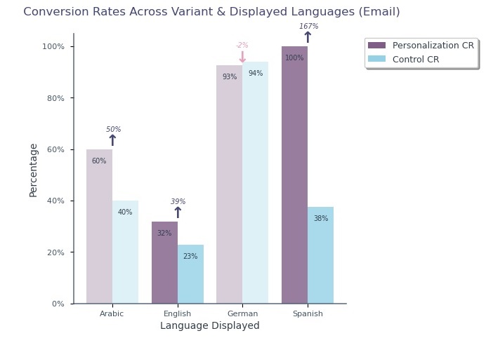
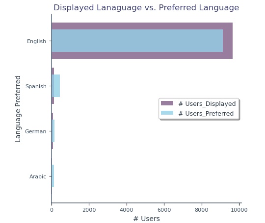
Language mismatches,
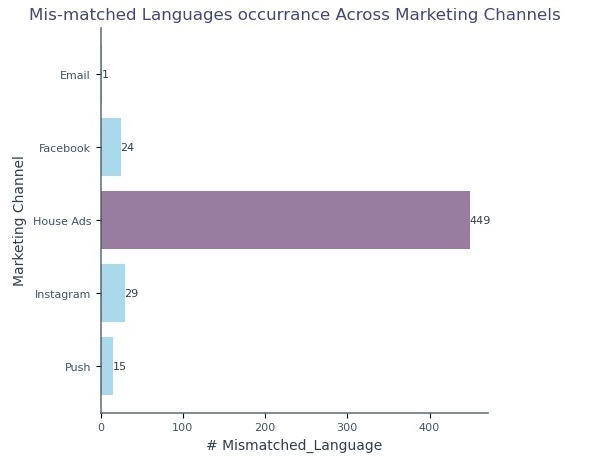
97.55% of ads served in English despite multilingual users—introduced bias and skewed channel performance, especially in House Ads.
Uneven distribution of exposures
77.07% of users saw only one ad, while a small segment (22.93%) saw up to 12 impressions, heavily influencing conversion/retention outcomes.
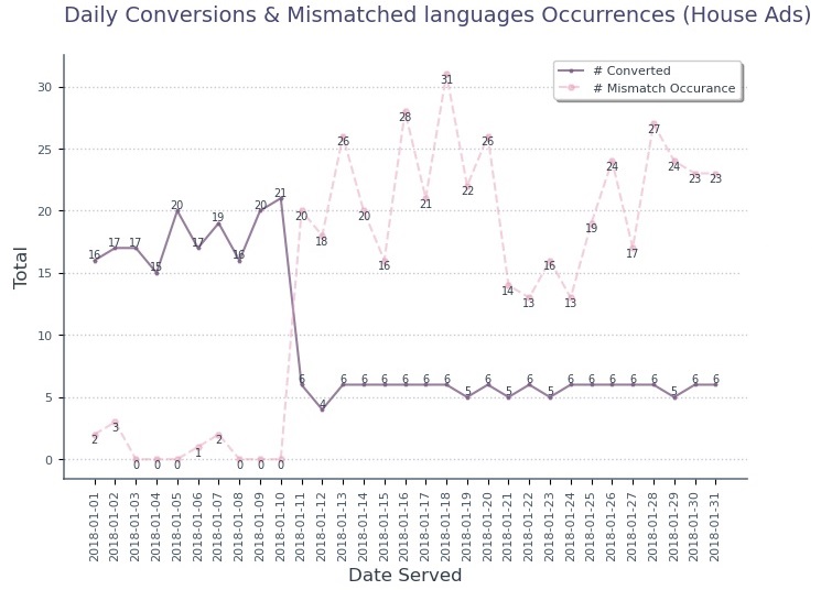
Technical bug in House Ads
caused recurring language mismatches after January 10, heavily distorting conversion rates.
Achievements
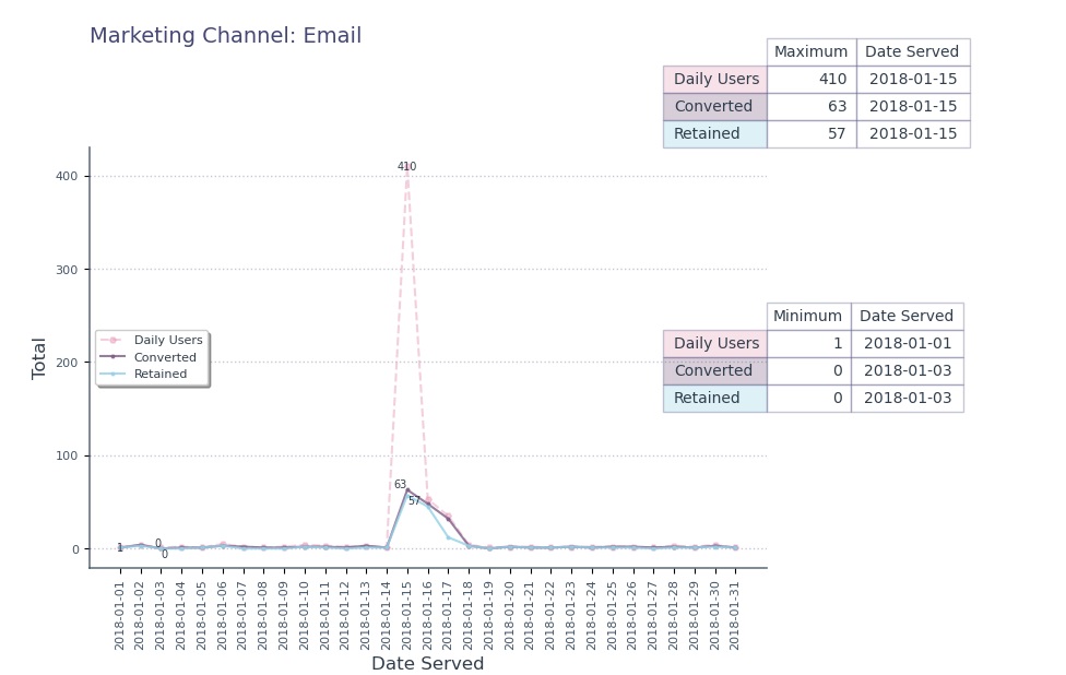
Peak daily exposure:
occurred on 15-01-2018 with 784 users.
Weekly engagement:
was highest on Mondays (1,977 users), followed by Wednesdays (1,610) and Tuesdays (1,588).
Supscription:
10.47% of all users converted after seeing an ad.
Variant:
Users were almost evenly assigned between the control and personalization groups.
Language:
97.55% of ads displayed in English; language mismatch occurred 449 times, mainly from House Ads (86.68%).
Age distribution:
heavily skewed toward younger users: 47.33% under age 30, with the largest segment being 19–24 (1,304 users; 16.56%).
Channel distribution:
House Ads (47.08%), Facebook + Instagram (≈29%), Push (9.96%), Email (5.65%).
Ad repetition:
77.07% one-time exposure, 22.93% multi-exposure.
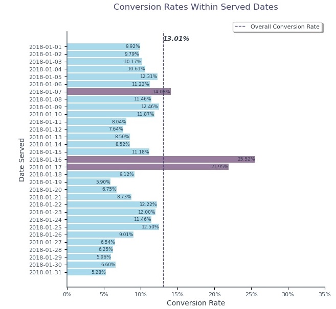
- Overall Conversion Rate ≈ 13.01%
- Email (33.75%) highest overall - Despite its low distribution (5.65% of total Ads), & House Ads (7.40%) – Despite its extensive ad distribution (47.08%).
- Personalized ads: 16.80% vs Control: ≈10%
- Language match: 13.25%, non-matched: ≈6.70%
- German: 72.6%, Arabic: 50%, Spanish: 20%, English: 12.12%
- Younger Users (under 30) ≈ 19.29%, Older Users (above 30) ≈ 7.29%
- The 16th and 17th of January recorded the highest conversion rates at 25.52% & 21.95, respectively.
Retention Rates:
- Overall Retention Rate ≈ 65.95%.
- Email 76.47% (Highest), House Ads 58.05 (Lowest).
- Control ads: 67.63% vs Personalized: ≈65.5%
- German: 66.04%, Arabic: 58.33%, Spanish: 66.67%, English: 66.03%
- Matched language (66.33%) is significantly higher than non-matched language (51.85%).
- Ages 19-24 & 30-36 form the highest Retention Rates (68.65% & 64.53%, respectively).
- Ages 30-36 & 55+ tend to remain in a moderate Retention Rate despite their lower Conversion Rates.
Multi-exposure users:
Conversion 17.83%, Retention 70.19%, & One-time exposure: Conversion 11.58%, Retention 64.01%.
- Arabic and German outperformed other languages overall, showing strong conversion rates across most age groups, & English had the weakest performance, especially among users aged 30 and above, where conversion rates drop significantly.
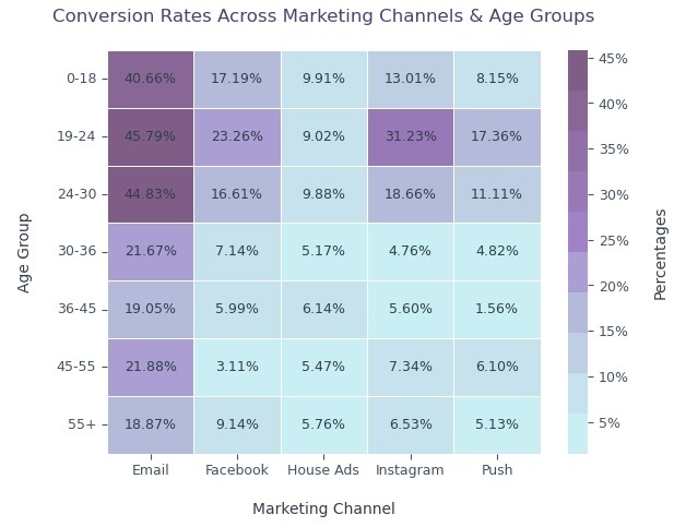
- Ages 19–24 consistently exhibit the highest conversion rates across all marketing channels, within this age group, Email performs strongest (45.79%), followed by Instagram (31.23%) and Facebook (23.26%).
Supscription Pattern:
Email is the strongest marketing channel across all age groups, especially for users younger than 30.
Variant Pattern:
Personalized ads are highly effective among younger audiences (under 30), while simpler, non-personalized messages may resonate better with older users (30+).
Language Bug Impact:
The Overall Estimated Lost Subscribers via House Ads (with no bug) ≈ 26, Arabic ≈ 12, German ≈ 10, & Spanish ≈ 6.
- The Email Personalization Group outperformed Control Group by 38.85%.
- Email Personalized Ads in English & Spanish performed well with an increase by 31.85% & 166.67 % respectively.
- Ages below 30: Email Personalized Ads outperformed Control Ads, showing strong positive lift (121.40% for 0-18, 106.24% for 19-24, & 161.19% for 24-30).
Insights
Marketing channels strongly influence performance:
Email and Instagram are the most efficient, with Email generating the highest conversion and retention rates despite low distribution.
Personalization increases conversions but not retention:
Personalized ads outperform control in conversions but underperform in long-term retention, especially for users aged 30+.
Demographic influences are significant:
Younger users (under 30) convert and retain better; German and Arabic-speaking users show exceptionally high conversion rates across age groups.
Multi-exposure campaigns are effective:
Users shown ads multiple times demonstrate significantly higher conversion and retention rates, confirming the positive reinforcement effect.
House Ads underperform severely:
High distribution but low conversion/retention due to technical language mismatches. After January 10, mismatches rose sharply while conversions dropped.
Temporal patterns matter:
Mid-month peaks, particularly January 15–17, strongly correlate with the impact of email campaigns.
A/B Testing confirms Email personalization success:
Statistically significant improvement in conversion suggests personalized email content is effective (p-value ≈ 0.65%).
Bias exists in conversion/retention comparisons:
Uneven exposure, disproportionate language distribution, and small subgroup sizes limit generalizability.
Recommendations
Fix the language-serving bug immediately:
Language mismatches directly reduced conversions, especially for Arabic and German users.
To improve reliability and reduce bias in future analyses:
It is recommended to ensure balanced sample sizes across demographic segments and apply randomization techniques when assigning ad types and exposure levels.
Reallocate budget toward Email, Instagram, and Facebook:
Where, both conversion and retention outcomes are strongest. Reduce reliance on House Ads.
Adopt multi-touch exposure strategy:
A controlled frequency cap (2–5 exposures) increases conversions without overwhelming users.
- Younger users → Focus on personalized ads and social media channels.
- Older users → Use simpler control-style messaging through email.
Redesign personalization strategy:
Use personalized content for acquisition but incorporate standard messaging for retention.
Improve tracking infrastructure:
To prevent duplicate conversions and inconsistent logs.
Strengthen experiment design:
By balancing exposure across language groups and ensuring randomized distribution.
Conduct a second A/B test after system fixes:
To validate personalization impact without data bias.
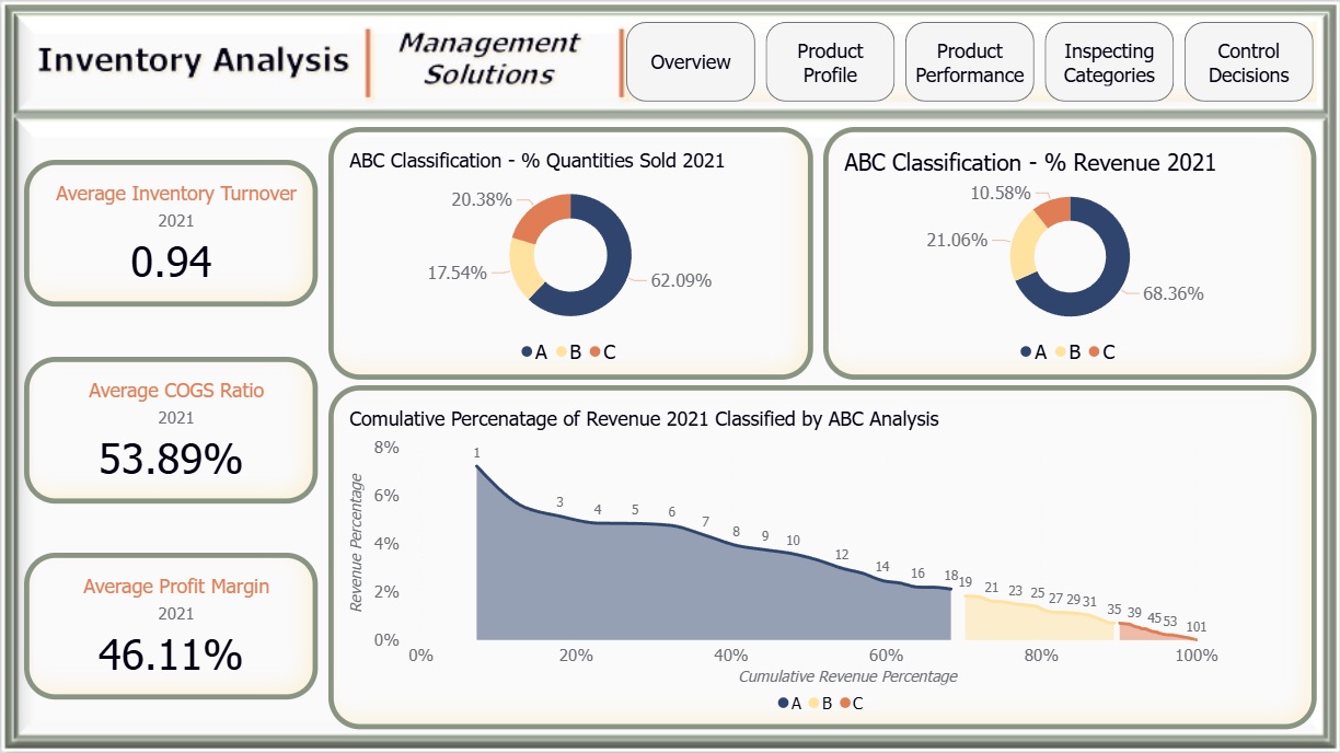
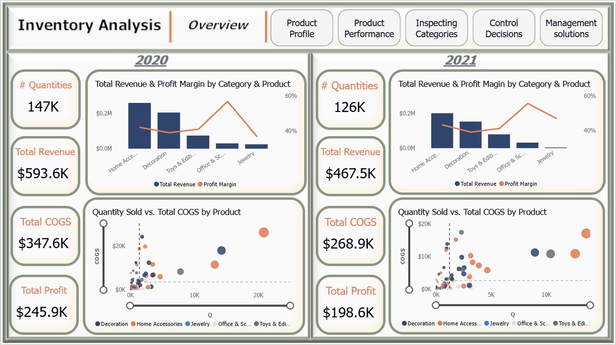
Inventory Analysis
See More
Overview
A dataset from WarmeHands Inc. was analyzed to explore opportunities for improving inventory management and purchasing strategies. The dataset reflects real-world challenges where not everything is perfect.
The focus year was 2021, with comparisons against 2020.
- Identifying purchase options that maximize gains.
- Recommending control policies aligned with company goals.
- Highlighting factors to improve stock management.
- Which items are best for renewing or increasing inventory?
- How can this be analyzed by category?
- What is the influence of countries?
Reporting Results
Relation between COGS, Sales, and Profit:
Measured using COGS-to-Revenue ratios to guide purchasing and logistics decisions.
Second-chance items:
Investigated the “B-Medium Value” group from ABC Analysis to assess selling potential, with a spotlight on its top buyers.
Impact of ABC Analysis:
Ranked products by revenue contribution to assess how quickly classes A, B, and C cover cumulative revenue.
Tools & Techniques
Power BI for calculations, data visualization and interactive dashboards.
Roles & Responsibilities
Data Cleaning:
Applied Power Query to ensure accuracy.
Data Manipulation:
Used Power Query & DAX for deriving insights.
Data Visualization:
Designed clear charts to reflect dataset insights.
Analysis:
Reviewed key influencers on inventory performance.
Challenges Faced
- Calculated Total Revenue, COGS, and Profit for 2020–2021.
- Derived Average Inventory Value and Inventory Turnover to measure stock usage.
- Applied ABC Analysis to prioritize products by revenue contribution.
Initial Investigation
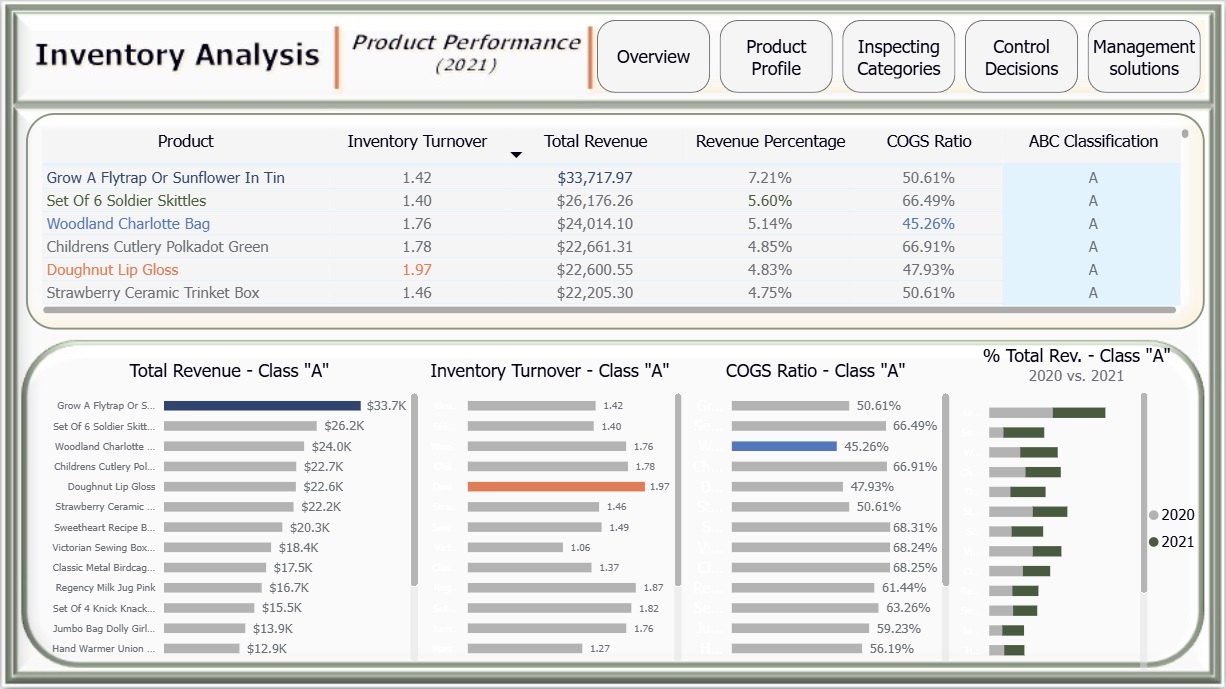
Product Performance:
- 3 products had no sales in 2021.
- Most items had higher revenue % in 2020 than in 2021, except Set of 6 Soldiers Skittles, which rose from 2% to 6%.
- ABC Analysis results: 18 products = A, 17 = B, 69 = C.
- Some low-value (C) items showed high inventory turnover, suggesting ABC alone may not fully explain performance.
- In 2021:
- Grow a Fly Trap → highest sales revenue.
- Doughnut Lip Gloss → fastest-selling (highest turnover).
- Set of 6 Soldiers Skittles → biggest revenue increase.
- All three ranked as A class.
- Woodland Charlotte Bag (A class) had the lowest COGS ratio (45%).
- Units sold in 2021: A = 78K, B = 22K, C = 26K.
Inspecting Categories:
- Jewelry:
- Profit margin improved (37% → 47%) due to fewer high-COGS products sold.
- Despite high average COGS ($5.1/unit), Jewelry delivered the lowest profit ($2K in 2021) and lowest revenue ratio (0.07%).
- All Jewelry items were ranked C in 2021, with the highest average COGS ratio (61%).
- Office & School:
- Highest inventory turnover (1.28).
- Lowest average COGS (33%).
- Mostly ranked as C, with only 3 items in B.
- Ranked 4th by revenue contribution.
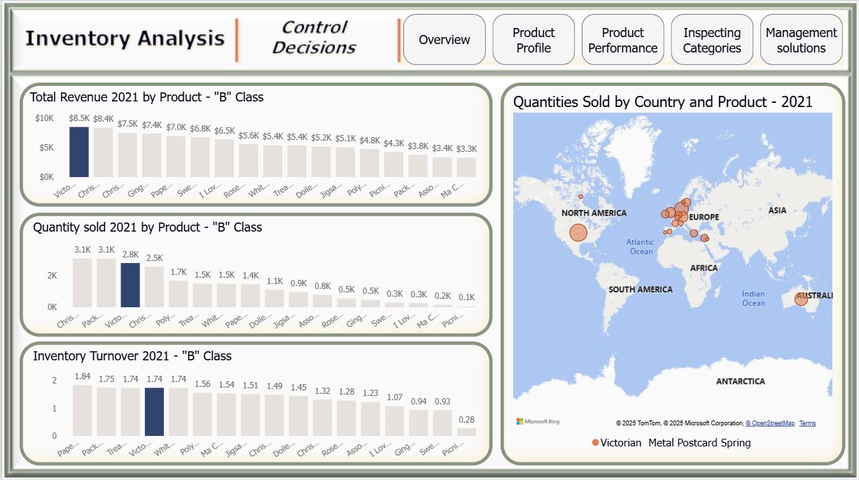
- Control Decisions Within "B" Items:
- Victorian Metal Post Card → top revenue ($8.5K), 2764 units sold, turnover = 1.74.
- Mainly sold in Europe, especially Denmark (457 units).
- Management Solutions:
- A Class: 18 items (17% of total) covered nearly 70% of revenue.
- B Class: 17 items contributed about 20% of revenue.
- C Class: 69 items contributed only 10% of revenue.
Insights
- Set of 6 Soldiers Skittles generated $8.78K profit on just 2.3K units sold → highly profitable despite low volume.
- 3 “A” items had similar turnover rates, showing consistent demand.
- All Jewelry items ranked C, highlighting weak profitability → category needs reevaluation.
- Victorian Metal Post Card (B class) had high turnover despite small revenue → demand exists but stock is limited.
- A and B classes had a similar number of products, but revenue impact was highly skewed:
- A = 70% revenue coverage.
- B = 20% coverage.
- This indicates A items dominate revenue due to stock scale.
Recommendations
- Prioritize A class products with low COGS ratios (e.g., Woodland Charlotte Bag) to maximize profitability.
- Increase inventory of promising B class items, such as Victorian Metal Post Card, to capture unmet demand.
- Reconsider or downscale the Jewelry category, as all products fall into C class with poor returns.
- Combine ABC Analysis with turnover insights, since high-demand items can exist outside A class.
Future Applications
- Apply predictive modeling (e.g., demand forecasting) to better plan stock levels.
- Expand ABC analysis into multi-dimensional frameworks (e.g., considering turnover, profitability, and regional demand).
- Use Power BI to continuously monitor inventory KPIs like turnover, revenue-to-COGS ratio, and category-level profit margins.
- Implement “second-chance” trials for selected B class products in targeted regions (e.g., Denmark for Victorian Metal Post Card).
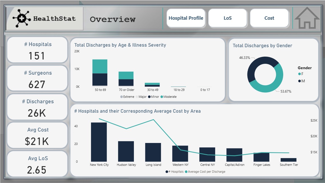
Analyzing Health Care Data
See More
Overview
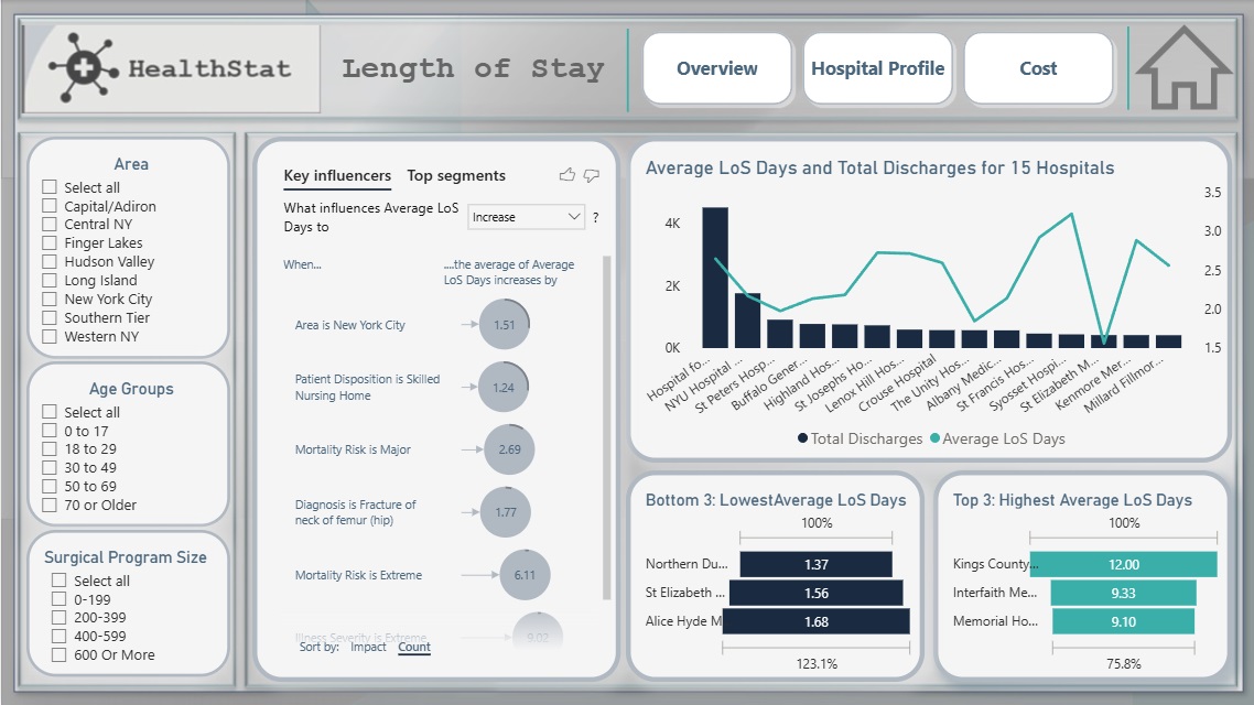
This project explores a real-world dataset to uncover hospital efficiency insights for HealthStat, a fictional consulting company. The analysis focused on the attributes impacting patient Length of Stay (LOS) and treatment cost, with the goal of identifying factors contributing to hospital performance differences.
The study concentrated exclusively on Elective Hip Replacement Surgical Inpatient stays in New York State (NYS).
Tools & Techniques
Power BI for calculations, data visualization and interactive dashboards.
Roles & Responsibilities
Visualization:
Selected and developed the most appropriate charts for effective data presentation, ensuring the dataset’s key insights were clearly reflected, and applying the suitable filters.
Analysis:
Conducted in-depth reviews to identify key influencers affecting hospital efficiency.
Challenges Faced
Identifying key efficiency drivers:
A root cause analysis was conducted to uncover the main factors influencing both LOS and cost, ensuring robust and accurate insights.
Achievements
Overview:
- Analyzed 151 hospitals in NYS that collectively performed over 26K hip replacement surgeries conducted by 627 surgeons.
- Found that patients aged over 50 constituted the majority, with illness severity ranging from minor to moderate.
- Female patients represented 53.67% of total surgeries.
- NYC recorded the largest number of hospitals (44), with the highest average cost of $25.5K. Surprisingly, Long Island had the second highest average cost ($25.4K) despite ranking third in hospital count.
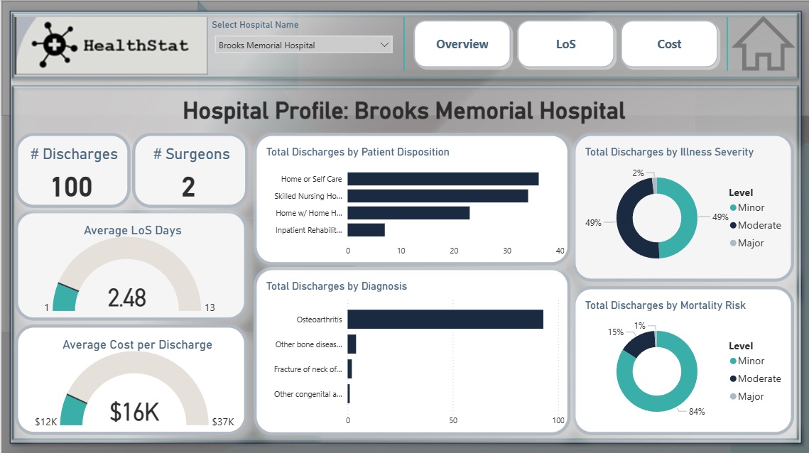
Hospital Profile Dashboard:
- Total Discharges & number of Surgeons.
- Average LoS and Average Cost Per Discharge.
- Discharges by Illness Severity & Mortality Risk.
- Total Discharges by Patient Disposition & Dignosis.
Insights
Key factors influencing Length of Stay (LoS):
- Extreme Illness Severity.
- Major or Extreme Mortality Risk.
- Fracture of Neck of Femur (Hip) Diagnosis.
- NYC hospitals recorded the highest average LOS, potentially linked to the region’s high hospital density.
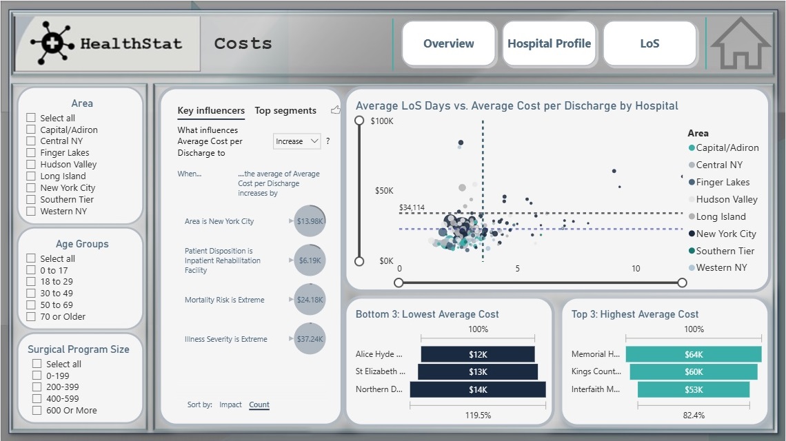
Key factors influencing Cost:
- Residency in NYC.
- Patient Disposition to Inpatient Rehabilitation Facilities.
- Extreme Mortality Risk.
- Extreme Severity Level.
Recommendations
Target Efficiency Improvements:
Hospitals, particularly in NYC, should explore process optimization strategies for patients with extreme illness severity or mortality risk.
Regional Benchmarking:
Establish regional benchmarks for cost and LOS, with Long Island requiring closer evaluation due to disproportionately high costs.
Care Pathway Redesign:
Investigate post-surgery rehabilitation pathways, as inpatient rehabilitation disposition was a significant cost driver.
Data-Driven Monitoring:
Adopt dashboards for ongoing tracking of hospital efficiency metrics, enabling proactive decision-making.
Future Applications
Scalability Across Specialties:
Expand analysis to other elective procedures (e.g., knee replacement, cardiac surgery) for broader healthcare efficiency insights.
Integration with Financial Planning:
Use efficiency insights to guide hospital budgeting, workforce planning, and negotiations with insurance providers.
Public Health Policy:
Support state-level healthcare policy decisions by highlighting regions with disproportionately high costs or LOS for targeted interventions.
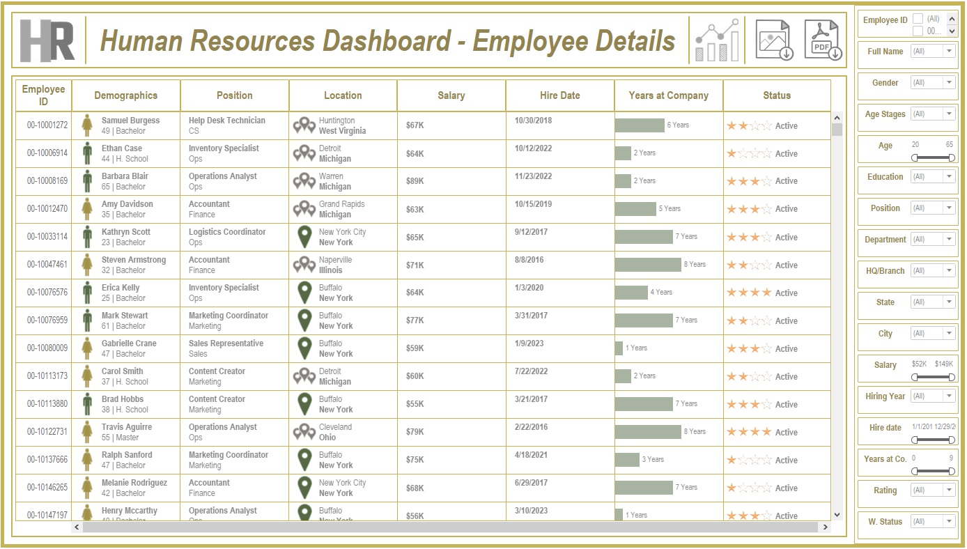
Human Resources Tableau Dashboard
See More
Overview
Created a comprehensive Tableau dashboard to analyze employee data, gaining insights into workforce aspects, including demographics, hiring and termination trends, and salary distributions. This analysis aimed to understand employee characteristics, department-specific trends, and performance evaluations to drive data-informed decisions.
Tools & Techniques
Tableau for calculations, data visualization and interactive dashboards.
Roles & Responsibilities
Data Cleaning:
Verified data types, identified null values, and inspected unique entries, such as detecting nulls in the 'termdate' column indicating non-terminated employees.
Visualization:
Selected the most appropriate charts for effective data presentation and created a comprehensive employee information table.
Analysis:
Conducted statistical analysis to identify trends in hiring, terminations, and salary distributions.
Challenges Faced
Data Gaps:
Identified missing values in critical fields, requiring strategies for accurate interpretation.
Complex Relationships:
Analyzed complex relationships between hiring, terminations, and department-level trends.
Data Standardization:
Needed to verify data consistency across branches and departments for accurate insights.
Achievements
Employee Analysis:
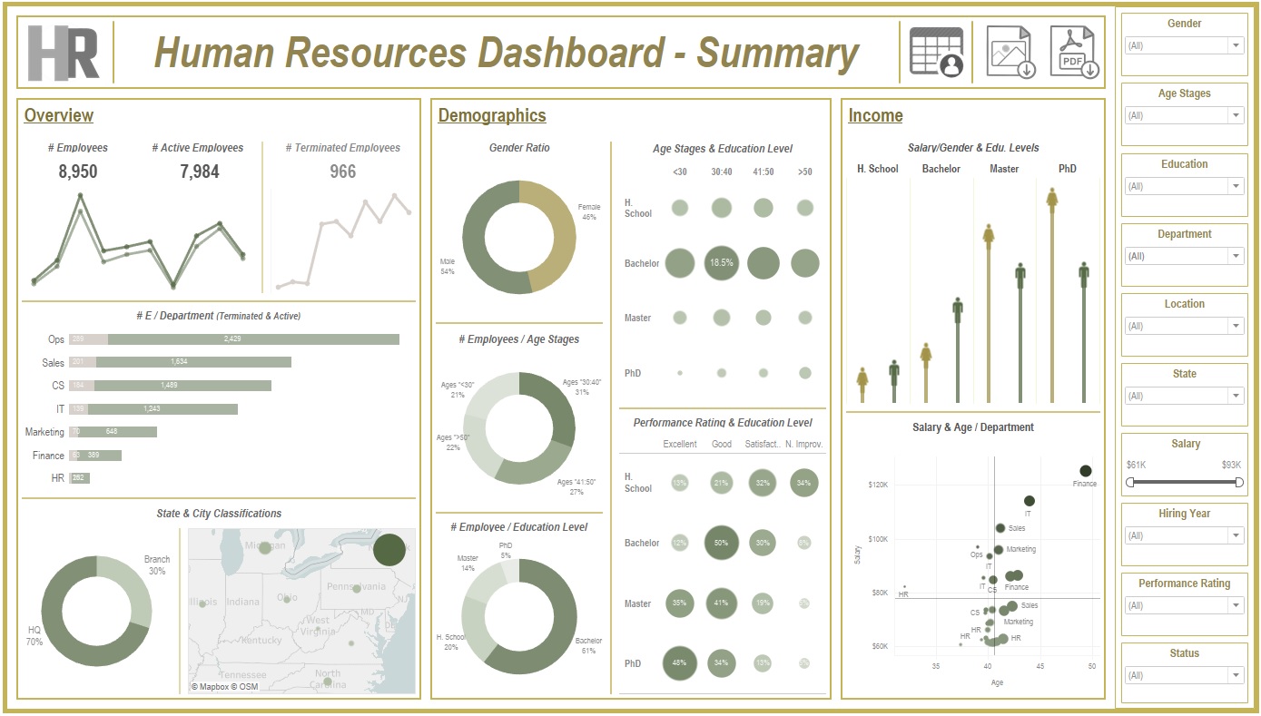
Total employee count reached 8,950 (7,984 active, 966 terminated).
Hiring Trends:
Noted peak hiring in 2017 with 1,560 new employees, while 2021 experienced the lowest hiring rate with 382 hires.
Termination Analysis:
Found that 2023 had the highest terminations, with 174 employees (18% of total terminations), predominantly in the Operations department.
Departmental Insights:
Operations had the highest activity, with 30% of both active and terminated employees, suggesting high turnover.
Geographical Distribution:
70% of employees were based at HQ in New York, which also had a higher termination rate.
Gender Analysis:
Gender distribution was slightly male-dominated (54%), with a balanced termination rate (11% each for males and females).
Educational Trends:
Identified that bachelor’s degree holders formed the largest employee group (61%) with noticeable termination disparities among educational levels.
Insights
Hiring & Termination Trends:
The Operations department’s turnover was high, and New York HQ showed the highest activity, with a considerable termination rate.
Gender & Education Dynamics:
Gender imbalances were observed in specific educational categories, with a higher termination rate among female high school graduates and male PhD holders.
Performance Ratings:
Educational level affected performance ratings, with high school graduates more often rated "Needs Improvement," while PhD holders frequently achieved "Excellent" ratings.
Salary Disparities:
Significant disparities were observed, with males earning more at the bachelor’s level, while females earned more at the PhD level.
Future Application
Workforce Planning:
Explore hiring and termination trends to optimize staffing and reduce turnover in high-activity departments like Operations.
Turnover Analysis:
Conduct a deeper analysis of the reasons behind turnover patterns, especially in specific positions and departments.
Gender & Education Balance:
Investigate gender disparities in salary and termination rates to promote equity.
Performance-Based Retention:
Reevaluate performance rating criteria and termination practices to ensure fair and consistent employee assessments.
Compensation Strategy:
Research if salary differences are consistent over time and explore whether performance and experience are accurately reflected in the company’s pay structure.
No Show Apointments
See More
Overview
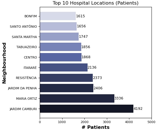
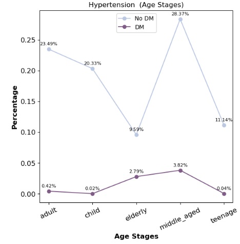
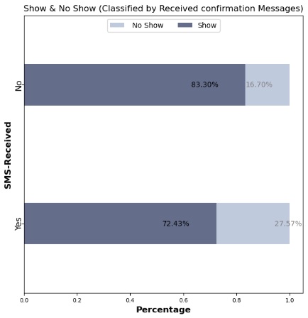
This project analyzes a dataset of 100,000 medical appointments in Brazil, focusing on the factors that impact patient attendance, such as demographics, health conditions, appointment scheduling gaps, and reminders. Key questions address the effects of gender, age, neighborhood, health conditions, and communication on attendance rates.
Tools & Techniques
Python for Data Assessment and Cleaning using Pandas & Numpy, and for Data Visualization using Matplotlib & Seaborn.
Roles & Responsibilities
Data Preparation:
Used to standardize column labels, add calculated columns, and categorize patient age groups and appointment scheduling gaps.
Data Exploration:
Applied statistical methods, including descriptive statistics, to understand patterns in attendance across demographic and health-related variables.
Analysis of Factors Influencing Attendance:
Assessed relationships between patient demographics, health conditions, appointment scheduling, and attendance.
Visualization:
Created charts and graphs to present findings on attendance patterns across different patient groups and appointment characteristics.
Recommendation Development:
Suggested approaches to improve appointment attendance, particularly through reminder systems and optimized scheduling.
Challenges Faced
Data Complexity:
A large number of variables, including demographic, health, and scheduling information, required careful analysis and categorization to maintain data integrity.
Categorization:
Defining and assigning appropriate categories for age groups and scheduling gaps posed challenges in achieving balanced, meaningful groupings.
Data Completeness:
Sparse neighborhood data limited definitive conclusions regarding neighborhood influence on attendance rates. Additionally, some appointment dates were recorded prior to their scheduled dates, leading to negative appointment gaps.
Achievements
Insights into Attendance Patterns:
Identified key factors, such as age, neighborhood, and reminder messages, that impact attendance rates.
Practical Recommendations:
Developed actionable suggestions for healthcare providers to improve attendance, including adjusting scheduling practices and implementing reminder systems.
Categorization Model:
Created a structured model for age and appointment gap categories to facilitate further analysis and comparisons.
Insights
Gender:
Women make up the majority of patients, with a high attendance rate across both genders, indicating no significant difference in attendance based on gender.
Age Groups:
Middle-aged, elderly, and child groups showed the highest commitment to appointments, suggesting a link between age and regular healthcare engagement.
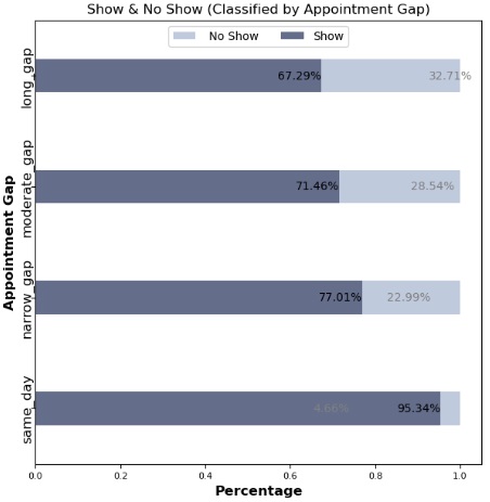
Appointment Scheduling Gap:
Patients are more likely to attend appointments with shorter scheduling gaps. Same-day and short-gap appointments had the highest attendance rates.
Neighborhood Influence:
Certain neighborhoods showed significantly higher attendance rates, although the data suggests this may also correlate with lower appointment counts in these areas.
Scholarship Status:
Attendance rates were marginally lower for patients with a government scholarship, indicating a potential but small effect.
Health Conditions:
Patients with chronic conditions such as hypertension or diabetes showed slightly higher attendance rates, which may indicate a greater commitment to health management among these groups.
Reminders:
Confirmations sent to patients increased attendance by over 10%, suggesting a strong positive impact from reminder messages.
Future Application
Enhanced Patient Reminder Systems:
Implement automated SMS or phone reminders to improve attendance rates, especially for moderate to long-gap appointments.
Optimized Scheduling Strategies:
Focus on offering same-day or short-gap appointment slots to increase attendance.
Neighborhood Targeting:
Conduct further studies to understand neighborhood-based attendance patterns, potentially incorporating geographic proximity or access factors.
Scholarship & Attendance Correlation:
Further statistical testing is recommended to understand the impact of government support on attendance consistency.
Personalized Engagement:
Apply insights on health conditions and age-related attendance patterns to create targeted communication strategies, potentially increasing engagement with chronic disease patients and elderly individuals.
Northwind
See More
Overview
The Northwind database is a sample database created by Microsoft, containing the sales data of "Northwind Traders," a fictitious company that imports and exports specialty foods worldwide. It includes details on customers, orders, inventory, purchasing, suppliers, shipping, employees, and single-entry accounting.
Tools & Techniques
SQL:
Created views and tables; adjusted database diagrams.
Python (Pandas):
Calculated growth rates.
Excel:
Employed Power Query, Power Pivot, and pivot tables to analyze data, create relationships, and develop interactive dashboards.
Roles & Responsibilities
Data Cleaning and Standardization:
Ensured data types and missing values were handled, particularly in shipping and ordering dates.
Data Analysis:
Analyzed sales trends, customer demographics, shipping efficiency, and product performance.
Dashboard Creation:
Developed seven dashboards summarizing critical insights into sales, product performance, and customer behaviors.

Challenges Faced
Incomplete Data:
Sales records spanned only from July 1996 to May 1998, requiring careful adjustments in year-over-year comparisons.
Data Consistency:
Managed inconsistencies in order quantities and stock levels, and standardized date data types.
Complex Growth Calculations:
Analyzed growth across inconsistent time periods to derive accurate trends.
Achievements
Growth Analysis Adjustments:
Created an "Actual Country Growth Table," yielding more accurate comparisons by aligning half-year periods for better insights.
Order and Customer Insights:
Classified 89 customers into new or repeat based on order activity, facilitating customer tracking and targeted insights.
Comprehensive Inventory Status:
Developed a robust stock status system, classifying products into Safe Stock, Restock Needed, No Restock, and Stopped.
Dashboard:
Completed a comprehensive, interactive dashboard with critical sales insights and key metrics.
Insights
Sales and Orders:
- Orders Summary: 830 orders processed for 89 customers, with 51,317 total quantities sold.
- Shipping Efficiency: Average shipping time was 8.48 days.
Product Analysis:
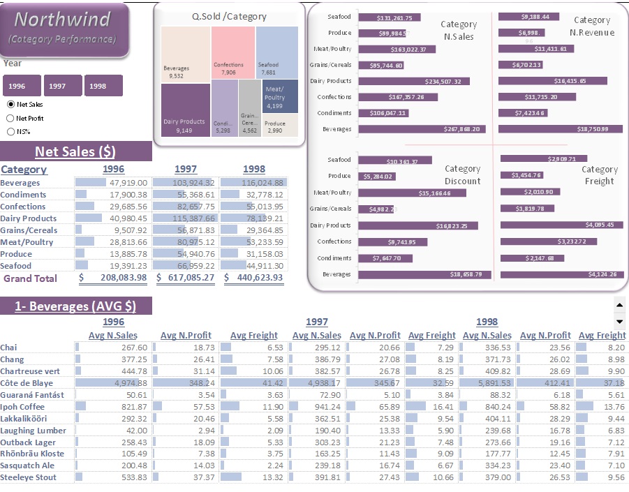
- Product Categories: 8 categories with 77 products.
- Net Sales: $1,265,793.18; Net Revenue: $89K.
- Discounts: Totaled $89K across all products
- Shipping Cost: $65K.
- Highest Net Sales by Month: Achieved in April 1998, totaling $124K.
Product Stock and Reorder Analysis:
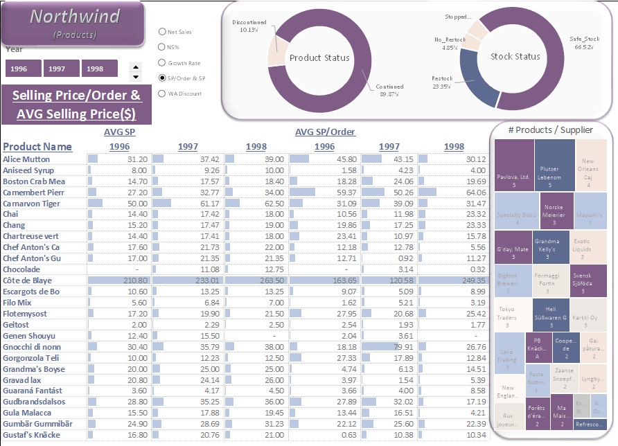
- Continued & Discontinued Products: 10.13% were discontinued, while 89.87% remained active.Of the active products: 66.52% were in "Safe Stock" status, and 23.35% required restocking.
- Top Category by Performance: Beverages, with net sales of $268K, net revenue of $19K, discounts of $19K, and $4K in freight, across each year.
Geographical Insights:
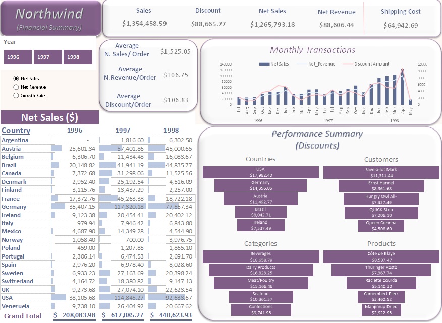
- Top Countries by Sales: in 1996: USA - $35K, in 1997: Germany - $117K, & in 1998: USA - $93K.
- Country with Most Customers: USA, with 13 recorded customers.
- Discount Performance by Country: USA had the highest discounts and net sales across all three years.
Customer Insights:
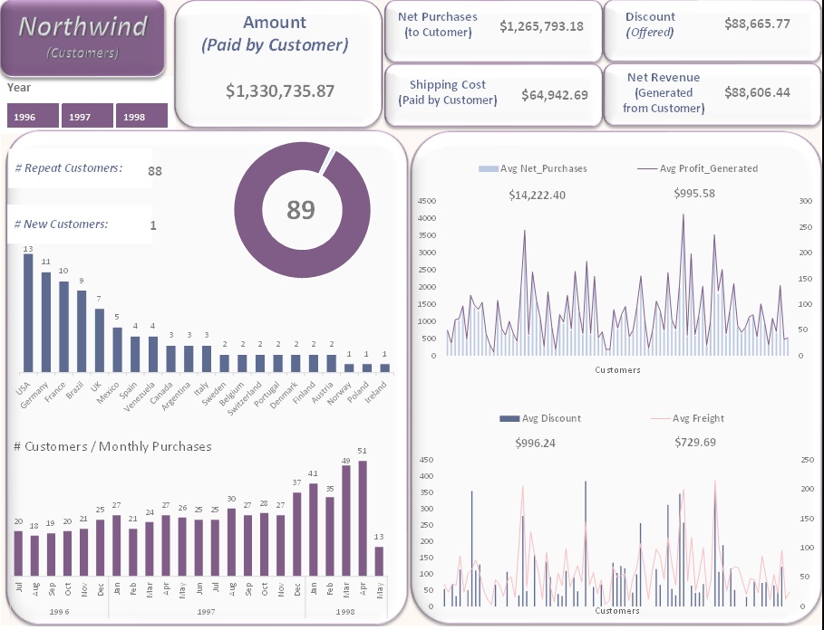
- Total Amount Paid by Customers (Including Shipping): $1.3M.
- New Customers in 1998: 1 new customer.
- Highest Monthly Sales: April 1998, driven by 51 customers placing orders.
Shipping Companies:
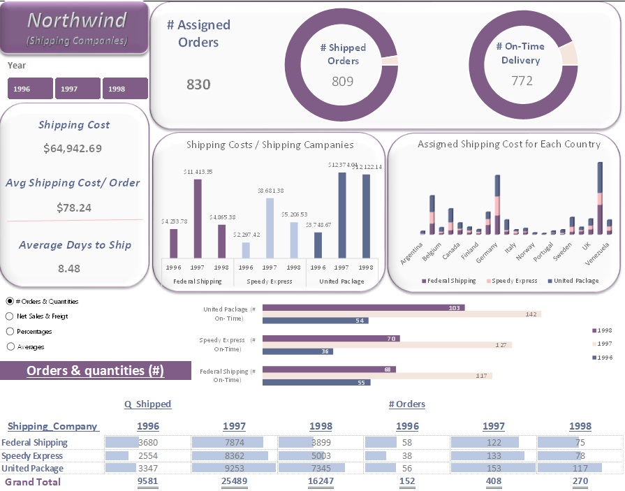
- Top Freight Costs by Year:
- 1996 → Federal Shipping - $4K
- 1997 & 1998 → United Package Company - $12K each year.
- Delivery Performance:
809 orders were shipped to their destination, with 772 delivered on time. - Highest On-Time Deliveries:
- 1996 → Federal Shipping - 55 on-time deliveries
- 1997 & 1998 → United Package Company with 142 and 103 on-time deliveries, respectively.
Future Application
Improve Inventory Management:
Use reorder level and stock status data to streamline restocking processes.
Optimize Shipping Processes:
Increase on-time deliveries by selecting shipping companies based on past performance.
Enhance Customer Targeting:
Focus on high-growth markets, like the USA, and monitor purchasing trends for customer retention and acquisition strategies.
Note: The values presented (in USD) are rounded to the nearest thousand or million.
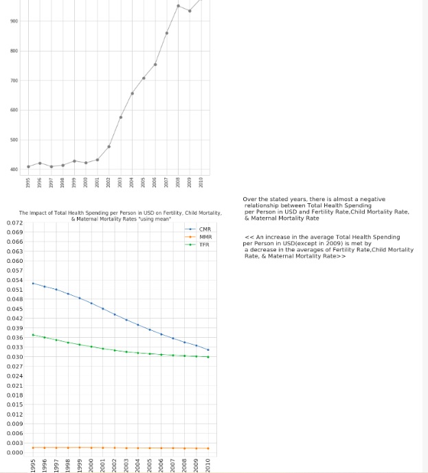
Death & Life Expectancy for Mothers & Children
See More
Overview
The dataset analyzes seven indicators impacting maternal and child health from 1995 to 2010 across six WHO regions. These indicators include Total Fertility Rate, Percentage of Births Attended by Skilled Health Staff, Child Mortality Rate, Maternal Mortality Rate, Average Life Expectancy, Total Health Spending per Person in USD, and Percentage of Total Health Expenditure in GDP.
Tools & Techniques
Python for Data Assessment and Cleaning using Pandas & Numpy, and for Data Visualization using Matplotlib & Seaborn.
Roles & Responsibilities
Data Analysis:
Evaluated health indicators for each region over the specified period.
Comparative Analysis:
Compared indicators across regions and years to identify trends and patterns.
Additional Research:
Investigated improvements, inconsistencies, and relationships between indicators.
Challenges Faced
- Addressed data quality issues such as null values and unpivoting columns.
- Managed large datasets by segmenting countries into regions for effective analysis.
Achievements
Trend Identification:
Noted trends such as decreasing Total Fertility Rates, Child Mortality Rates, and Maternal Mortality Rates across all regions.
Regional Insights:
Identified which regions had the highest and lowest values for each indicator.
Correlation Analysis:
Found relationships between health expenditure indicators and various health outcomes.
Insights
Total Fertility Rate:
Decreased overall, with AFR showing the highest rates and EUR the lowest.
Births Attended by Skilled Health Staff:
Highest in EUR and lowest in AFR. Inconsistencies in data affected the ability to determine relationships with other indicators.
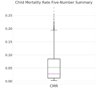
Child Mortality Rate:
Decreased globally, with AFR having the highest and EUR the lowest rates.
Maternal Mortality Rate:
Showed a global decrease, with AFR experiencing the highest rates and EUR the lowest.
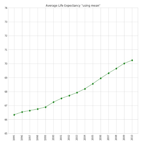
Average Life Expectancy:
Increased across regions, with EUR having the highest and AFR the lowest.
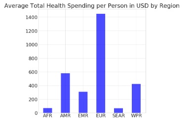
Total Health Spending per Person:
Showed an overall increase, with EUR spending the most and SEAR the least. It is considered a reliable indicator, though its impact on skilled birth attendance showed variability.
Percentage of Total Health Expenditure in GDP:
Generally increased, with EUR having the highest and EMR the lowest. It is considered a Significant indicator affecting health metrics, but with regional inconsistencies.
Future Application
- Compare findings with global health indicators from the same period.
- Investigate regional improvements and inconsistencies in health metrics.
- Explore reasons behind the decline in health expenditure and its impact on other indicators, especially in the SEAR region and in 2009.
About Me Projects Testimonials Education Experience Contact